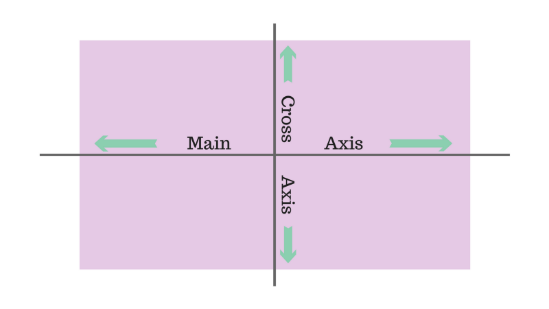
Last time we got started with the basic Flexbox properties: flex-direction, justify-content, align-items, and align-self.
These commands are powerful for creating basic layouts. But once you start building webpages with Flexbox, you’ll need to go deeper to maximize its potential.
Now let’s take a deep look into Flexbox sizing — and how you can leverage it to build adaptable and beautiful layouts.
Property #1: Flex-Basis
In the last article, we mostly looked at properties that apply to container elements. This time, we’re exclusively going to examine sizing applied to child elements.
Our first property is, in my opinion, one of the least well-explained properties in Flexbox tutorials.
But — don’t worry. It’s actually quite straightforward.
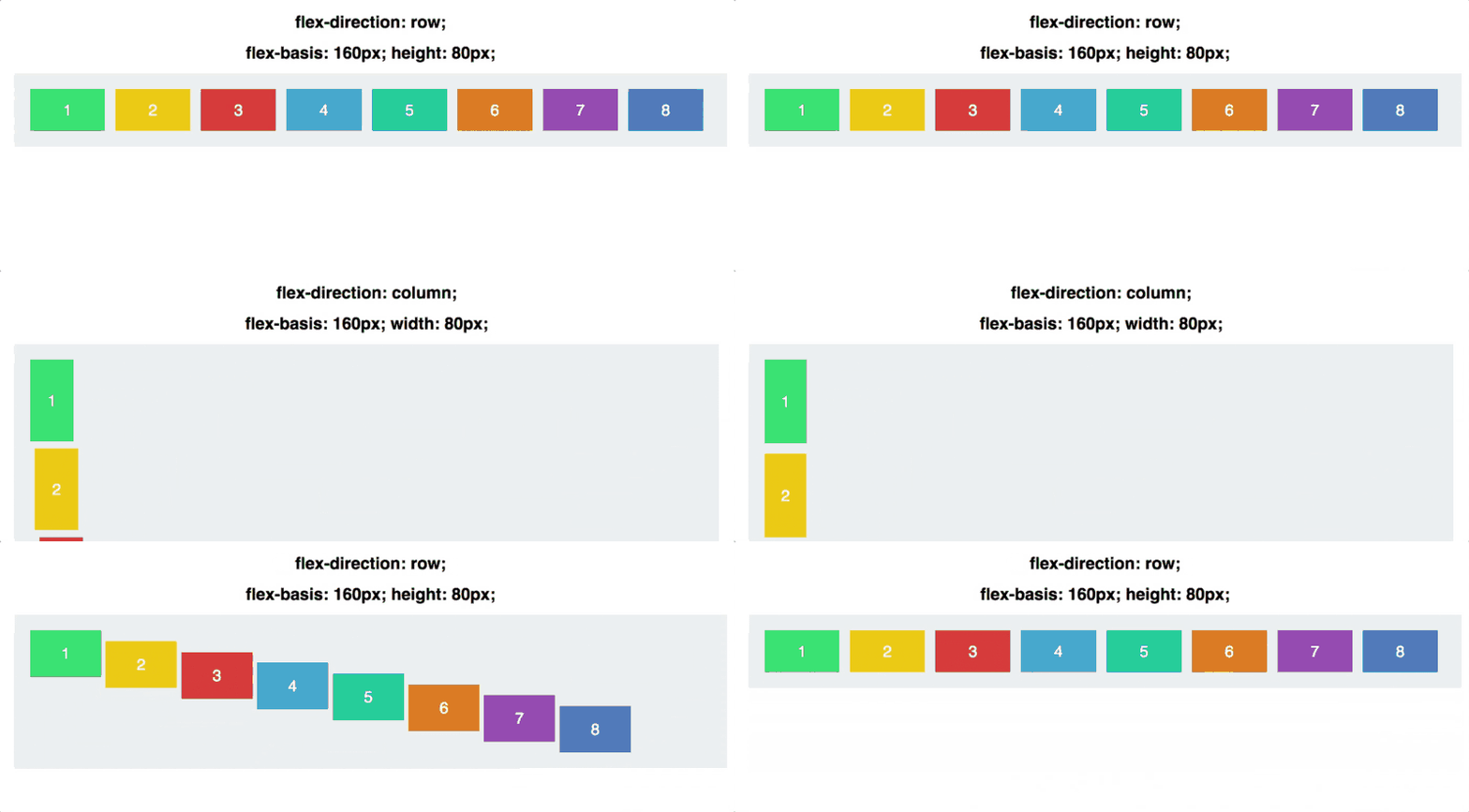
Flex-basis controls the default size of an element, before it is manipulated by other Flexbox properties (more on that later).
In the below GIF, this means it is interchangeable with the width property:

What makes flex-basis unique from width, however, is that it corresponds to our good ol’ flex axes:

Flex-basis affects an element’s size across the main axis.
Let’s see what happens when we keep our flex-basis the same, but switch the direction of our main axis:

Note that we had to switch from setting the height manually to setting the width. Flex-basis thus alternately determines width or height, depending on flex-direction.
Property #2: Flex Grow
Now we’re going to get a bit more complex.
First, let’s set all our squares to the same width, 120px:

Now, when it comes to the property called flex-grow, the default is 0. That means the squares are not allowed to grow to take up the space in the container.
What does that mean? Well, let’s try incrementing flex-grow to 1 for every square:

The squares collectively take up the entire width of the container, with the space evenly distributed among them. The flex-grow value overrides the width.
The confusing part about flex-grow, however, is what the value actually means. What does flex-grow: 1 actually imply?
Well, here’s what it looks like if we set the flex-grow of each square to 999:

It is… exactly the same.
That’s because flex-grow is not an absolute value — it’s a relative value.
What matters is not what a square’s flex-grow value is on its own, but what it is in relation to the other squares.
If we set every square to flex-grow: 1, and then adjust Square #3’s flex-grow, then we see the changes:

To really understand what’s going on here, let’s take a quick detour into some (simple) math.
Each square starts with a flex-grow of 1. If we add up the flex-grow of each square, our total is six. The container is thus divided into 6 separate sections. Each square grows to fill 1/6 of the available space in the container.
When we set the flex-grow of Square #3 to 2, the container is now divided into 7 different sections, since the total of the flex-grow properties is 1 + 1 + 2 + 1 + 1 + 1.
Square #3 then gets 2/7 of that space, and the rest get 1/7.
When we go to flex-grow: 3 for Square #3, the container is divided into 8 sections (1 + 1 + 3 + 1 + 1 + 1) and Square #3 gets 3/8, and the rest get 1/8.
And so on.
Flex-grow is all about proportions. If we set every square to flex-grow: 4, and square #3 to flex-grow: 12, we get the same result as if it were 1 and 3, respectively:

What matters is what each square’s flex-grow is proportional to the others.
As a final note, remember that just like flex-basis, flex-grow applies across the main axis. Our squares will grow width-wise only, unless we set the flex-direction to column.
Property #3: Flex Shrink
flex-shrink is the opposite of flex-grow, determining how much a square is allowed to shrink.
It only comes into play if the elements must shrink to fit into their container — i.e. when the container is just too small.
Its main use is to specify which items you want to shrink, and which items you don’t. By default, every square has a flex-shrink of 1 — which means it will shrink as the box contracts.
Let’s see it in action. In the below GIFS, the squares have a flex-grow of 1, so they fill the container, and a flex-shrink of 1, so they’re permitted to shrink as it does.

Now let’s set the flex-shrink of Square #3 to 0. It’s forbidden to shrink, so it while it grows to fit the container, it refuses to dip below its set 120px width.

The default value for flex-shrink is 1 — that means your elements will shrink until you tell them not to!
Again, flex-shrink is about proportions. If one box has flex-shrink of 6, and the rest have flex-shrink of 2, the one box will shrink 3x as fast as the rest, as space compresses.
Note the wording there: the square with a 3x flex-shrink will shrink 3x as fast. This does not mean it will shrink 1/3 of the width.
In a moment, we’re going to dive deeper into how much things shrink and grow. But first, let’s get to our last property, and bring everything together.
Property #4: Flex
flex is shorthand for grow, shrink, and basis — all put together.
It defaults to 0 (grow) 1 (shrink) and auto (basis).
For our last example, let’s simplify down to two boxes.
Here are their properties:
.square#one { flex: 2 1 300px;}.square#two { flex: 1 2 300px;}
Both have the same flex-basis. That means if there’s enough space for both of them (the container is 600px plus room for margins and padding), they will both be 300px wide.
But as the box grows, Square 1 (with the higher flex-grow) will grow twice as fast. As the box contracts, Square 2 (with the higher flex-shrink) will shrink twice as fast.
All together now:

How Things Shrink And Grow
Here’s what might be confusing: when Square 1 grows, it doesn’t grow to be twice as big as Square 2. Likewise, when Square 2 shrinks, it doesn’t shrink to be half the size of Square 1 — even though the ratio of flex-shrink is 2 to 1.
It’s not their size that is 2 to 1 or 1 to 2. It’s their rate of shrinking and growing.
A Little Math
The starting size for the container is 640px. After accounting for 20px padding on each side of the container, this leaves enough room for both squares to revert to their flex-basis of 300px
When the container is set to 430px, we’ve lost 210px of space. Square 1, with the flex-shrink of 1, loses 70px. Square 2, with the flex-shrink of 2, loses 140px.
When the container shrinks to 340px, we’ve now lost 300px of space. Square 1 loses 100px, Square 2 loses 200px.
The lost space is divvied up according to the ratio of their respective flex-shrinks (2 to 1).
It’s the same story with flex-grow. When the container grows to 940px, and we’ve gained 300px of space, Square 1 gets an extra 200px, and Square 2 gets an extra 100px.
When it comes to flex properties, proportions are the name of the game.

In the above GIF, you can see how the width adjusts according to the ratios, with the delta (∆) showing the difference from the flex-basis.
Conclusion
As a final recap: flex-basis controls how large an element will be along the main-axis before any growing or shrinking occurs. flex-grow determines how much it will grow in proportion to sibling elements, and flex-shrink determines how much it will shrink.
Thanks so much for reading! The response to these articles has been overwhelming. I really appreciate everyone taking the time to read, reply, recommend and share!
To stay up to date on my articles, subscribe to my email list.